case study
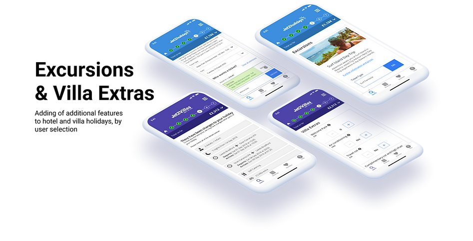
excursions and villa extras
overview
Jet2 is one of the largest holiday operators in the UK, and it consists of the multi-brand channels of Jet2.com (flights), Jet2Holidays, Jet2CityBreaks and Jet2Villas. It caters for Business and Personal travel across Europe and America, flying out from airports all over the UK.
my role
In my UX Designer role at Jet2, I worked on the Jet2 Holidays, Flights, Villas, and City Breaks brands. Across these brands I worked on:
-
Ideation and User Research
-
Sketching and Wireframing
-
Hi-Fidelity Design and Prototyping
-
User Testing
Introduction to case study
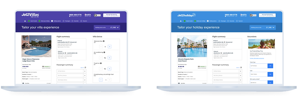
Across Jet2Holidays, a key business goal was introduced to be able to offer extra features to customers booking holidays, either in hotels or villas, by offering excursion packages and extra facilities in villas.
Research
The first thing I focused on was our research strategy. As these were new features to the platform, I conducted a competitor analysis examination and setup an information architecture analysis by conducting a customer-based card sort.
First I conducted a competitor analysis. Aside from using and understanding Jet2, this also gave me insight into the market space and provided additional context for the problem I was working on.
Secondly I created a card sorting exercise which was sent to a set of user persona type customers, to gather a collated set of results on the categorisation of the features of excursions and villa extras
insights
As part of our Competitor Analysis and card sorting exercise, a recurring pattern emerged at how users were arranging and classifying information.
I aggregated the sorting data and passed it through a similarity matrix to find the most frequent combinations and orders of information required to provide the most friction-free journey through the excursion selection and booking process.

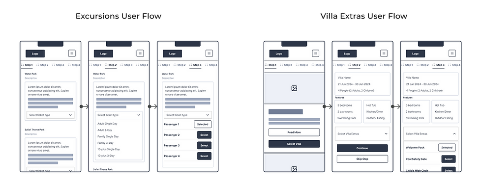
user flow
I took the information derived from the card sort aggregator and identified the user flow of the app. The focus was on informational display coherence and clarity up to the point of booking and the streamlining of process to add them to the booking.
how might we...
I conducted a brainstorming session, reframing the problem.
I started thinking about the excursion and extras process, and spent time sparking ideas for possible innovative solutions.

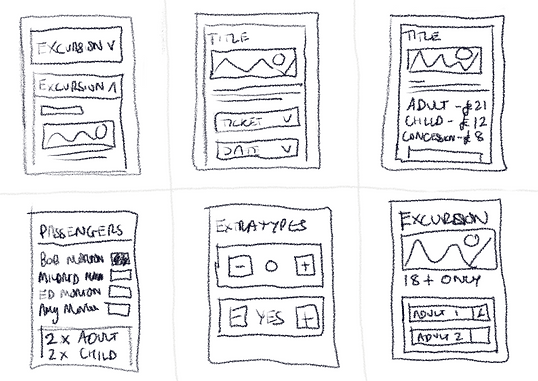
sketches
The next steps was to each do a 6-up lo-fi sketch using the new user-flow I created. Here quickly incorporating my brainstorming ideas into rough sketches.
.png)
lo-fi wireframes
After sketching out wireframes, I moved into Figma and created lo-fidelity wireframes. Following the user journey map, I chose a single ‘happy journey’ and mapped out the different designs.

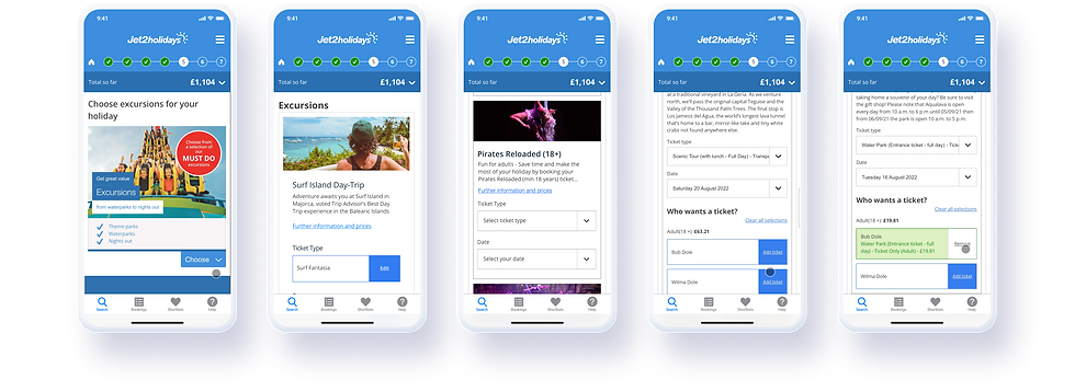
hi-fi designs
After building out our design system components, I took the lo-fi wireframes and recreated in Hi-Fidelity in Figma. Following the user journey map, I chose a single ‘happy journey’ and mapped out the different designs.
success metrics -
excursions & Extras
The HiFi Designs were built and set up as part of interaction and conversion tracking through optimizely. Examining the percentage of users who would interact and complete the journey of booking the excursions and extras, and the time their focus would converge on the individual sections of the designs.
37.4%
Conversion rate of excursions in total holiday booking journey.
-22.7%
Bounce Rate reduction on stage 3 / extras page on booking.
62.1%
Total Average view and interaction - users in extras section